Android 14's Updated Design: What's Changed?

Table of Contents
A Refined Visual Language: New Typography and Iconography
Android 14 boasts a refined visual language, starting with its typography and iconography. Google has subtly yet effectively tweaked the system's font styles and weights, resulting in improved readability and a more modern feel. The updated icon set enhances visual consistency across the entire system, providing a more cohesive and polished look.
- Font Changes: While the exact default font might vary depending on the device manufacturer, you'll notice a more consistent and refined application of weights across different UI elements. This leads to better visual hierarchy and easier navigation.
- Redesigned Icons: Many system icons have received a makeover, adopting a cleaner, more contemporary style within the Material Design 3 framework. The improved visual appeal contributes significantly to the overall aesthetic upgrade.
- Accessibility Improvements: The refined typography also benefits accessibility. Improved contrast ratios and clearer font distinctions make Android 14 easier to use for individuals with visual impairments.
Enhanced Material Design 3 Implementation
Android 14 significantly expands upon the implementation of Material Design 3. This isn't just a superficial change; it’s a fundamental shift that permeates user experience and interface consistency. The result is a more unified and intuitive interaction model.
- Dynamic Color: Android 14 leverages dynamic color theming more extensively, pulling accent colors from your wallpaper to personalize the system's look and feel. This creates a truly customized experience.
- Updated Widgets: Widgets have been redesigned to align seamlessly with the Material Design 3 guidelines, offering a more visually appealing and functional experience.
- Performance Enhancements: The optimized implementation of Material Design 3 contributes to smoother animations and improved overall performance, making the system feel more responsive and fluid.
Improved System-Wide Customization Options
Android 14 empowers users with unprecedented levels of personalization. Beyond simply choosing a wallpaper, users now have more control over the look and feel of their devices than ever before.
- Theme Customization: Extensive theme customization options allow users to tailor the system's appearance to their preferences, selecting from a range of pre-set themes or creating custom themes.
- Font Selection: Users can now choose from a wider variety of system fonts, allowing for even greater personalization.
- Icon Pack Support: Enhanced compatibility with third-party icon packs provides users with limitless possibilities to create a truly unique Android experience. This opens the door for greater visual personalization.
Notification and Quick Settings Redesign
The notification shade and quick settings panel have undergone a significant revamp in Android 14. The changes focus on improved organization and easier access to crucial information.
- Visual Changes: The notification shade boasts a cleaner, more streamlined design. Quick settings tiles are visually more distinct, improving usability.
- Improved Organization: Notifications are presented more clearly, allowing for better management and prioritization. This improves the overall user experience.
- New Notification Management: New tools and preferences provide users with more control over how they manage and interact with notifications.
Addressing Accessibility with Design Improvements
Accessibility is a core focus in Android 14's design enhancements. Several features specifically improve usability for people with disabilities.
- Improved Contrast Ratios: Increased contrast between text and background elements enhances readability for users with low vision.
- Larger Font Sizes: Support for even larger font sizes ensures greater comfort and readability for individuals with visual impairments.
- Enhanced Navigation: Improved navigation features make the system easier to use for individuals with motor impairments. This includes simplified gestures and improved voice control options. Android 14 complies with several key accessibility standards, showing a commitment to inclusivity.
Conclusion: Embrace Android 14's Updated Design
Android 14's updated design represents a significant leap forward in user experience. From the refined typography and iconography to the enhanced Material Design 3 implementation and improved customization options, every detail has been carefully considered to create a more visually appealing, intuitive, and accessible mobile operating system. The improvements to notifications, quick settings, and accessibility features further underscore Google's dedication to user-centric design. Embrace Android 14's updated design; update your device today and experience these improvements firsthand! Explore the new design features and unlock a more personalized and enjoyable mobile experience.
Featured Posts
-
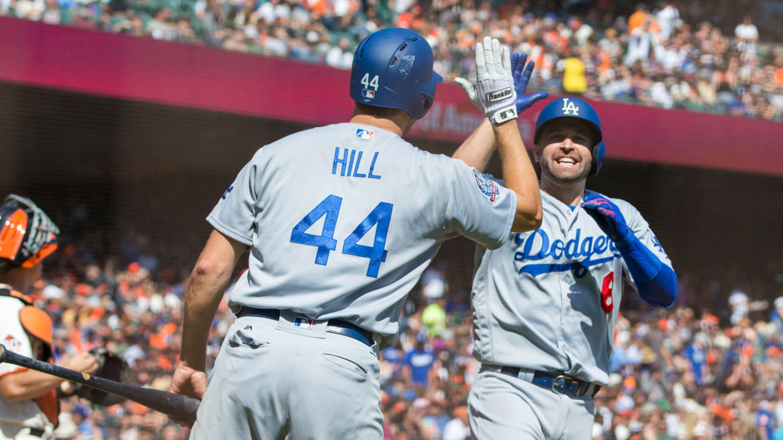 Late Game Home Runs By Freeman And Kim Secure Dodgers Win Against Giants
May 15, 2025
Late Game Home Runs By Freeman And Kim Secure Dodgers Win Against Giants
May 15, 2025 -
 Ohtanis Selfless Act The Real Story Behind The Home Run Celebration
May 15, 2025
Ohtanis Selfless Act The Real Story Behind The Home Run Celebration
May 15, 2025 -
 San Diego Padres Vs San Francisco Giants Game Prediction And Analysis
May 15, 2025
San Diego Padres Vs San Francisco Giants Game Prediction And Analysis
May 15, 2025 -
 Paddy Pimblett 40 Pound Weight Gain After Ufc 314 Fight
May 15, 2025
Paddy Pimblett 40 Pound Weight Gain After Ufc 314 Fight
May 15, 2025 -
 Kibris Fatih Erbakandan Sehitlerimize Saygi Dolu Aciklama
May 15, 2025
Kibris Fatih Erbakandan Sehitlerimize Saygi Dolu Aciklama
May 15, 2025
Latest Posts
-
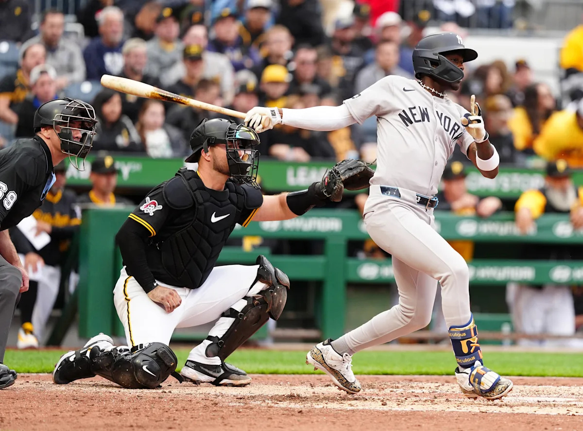 Mlb All Stars Torpedo Bat Confession The Untold Story
May 15, 2025
Mlb All Stars Torpedo Bat Confession The Untold Story
May 15, 2025 -
 Dodgers Muncy Comments On Arenado Trade Rumors
May 15, 2025
Dodgers Muncy Comments On Arenado Trade Rumors
May 15, 2025 -
 Max Muncys 2025 Home Run A Career Drought Snapped
May 15, 2025
Max Muncys 2025 Home Run A Career Drought Snapped
May 15, 2025 -
 Muncy Breaks Silence On Arenado Dodgers Trade Speculation Explained
May 15, 2025
Muncy Breaks Silence On Arenado Dodgers Trade Speculation Explained
May 15, 2025 -
 Mlb All Star Reveals Torpedo Bat Dislike Reasons Why
May 15, 2025
Mlb All Star Reveals Torpedo Bat Dislike Reasons Why
May 15, 2025

